Old Mutual App
→ Old Mutual
Old Mutual, one of Africa's largest financial service providers, had a multitude of existing mobile apps that needed to be combined into a single converged app experience, and they needed a concept that would differentiate them in the market and delight their customers.
Financial apps are boring. Wallpaper in a marketplace of incredible app experiences.
The external UX team had planned a seriously traditional financial service app experience, and we saw the opportunity to redefine how customers could engage with their financial world.
The Process
We debated the core purpose of the app. Rather than just being a complicated aggregation of all of the functionality from the four existing apps, we wanted the new experience to centre around a core theme. Through focus groups and loads of debate, we agreed that the core theme of the app should be progress. We wanted users to experience a feeling of progress each and every time they opened the app, from executing the smallest of task, to achieving a big financial goal.
Inspiration from other app types
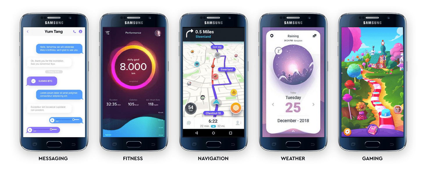
We broke away from the financial service sector and explored interfaces that used progress as a key element in their design, from messaging to fitness apps to games. All of these apps use visual cues and engagement tactics to keep the user coming back to progress further.
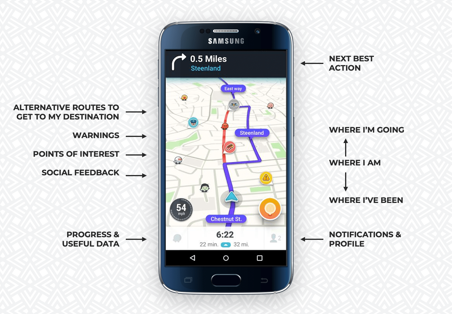
We locked on to the idea of a financial GPS and loved the parallels between how a GPS responds to a users goals and actions, and how a financial app should.
- A GPS lets you set a goal, and gives you feedback in terms of how long it will take for you to reach your goal.
- It tells you where you are, where you’re going, and where you’ve been.
- It lets you decide how you want to get to your destination.
- It doesn’t judge you for taking a wrong turn… it just re-routes you to get you back on track.
- It offers you warnings along the way, doing its best to keep you out of trouble.
We explored dozens of ways to visualise a financial journey in unconventional ways. As soon as we had a rough direction that we felt was good enough for some user testing, we went into the lab to see if users actually understood it.
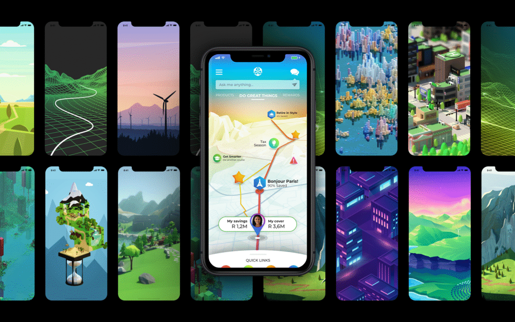
The feedback was better than we ever expected. Users loved the fresh approach. They understood the interface, and intuitively knew how to navigate it. They loved the idea of seeing their financial journey mapped out before them, with rewards, points of interest, and learning opportunities scattered along the way.
Despite the unanimously positive feedback from users, the UX team decided that the complexity of building the interface in this way was too great considering the timing and budget constraints of the project, so we were forced to simplify the interface and create a more conventional dashboard type interface.
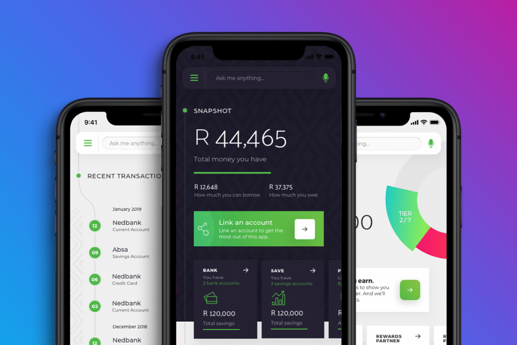
Despite having to say goodbye to the GPS style interface, we retained the idea of an interface anchored along a timeline, allowing the user to scroll back to view past behaviour and into the future to set goals.